Hand made simulation plot
Sometimes your data is for divulgation purposes, and there is no reason to bore your audience, so in order to show your results in a different way you can use different type of styles in your graphics.
-First Download a font and extract it-Install your font or copy it into your font directory
[user@andromache directory]# cp mynewfont.ttf /usr/share/fonts/myfonts
In this example we will use the xkcd libraries:
Data
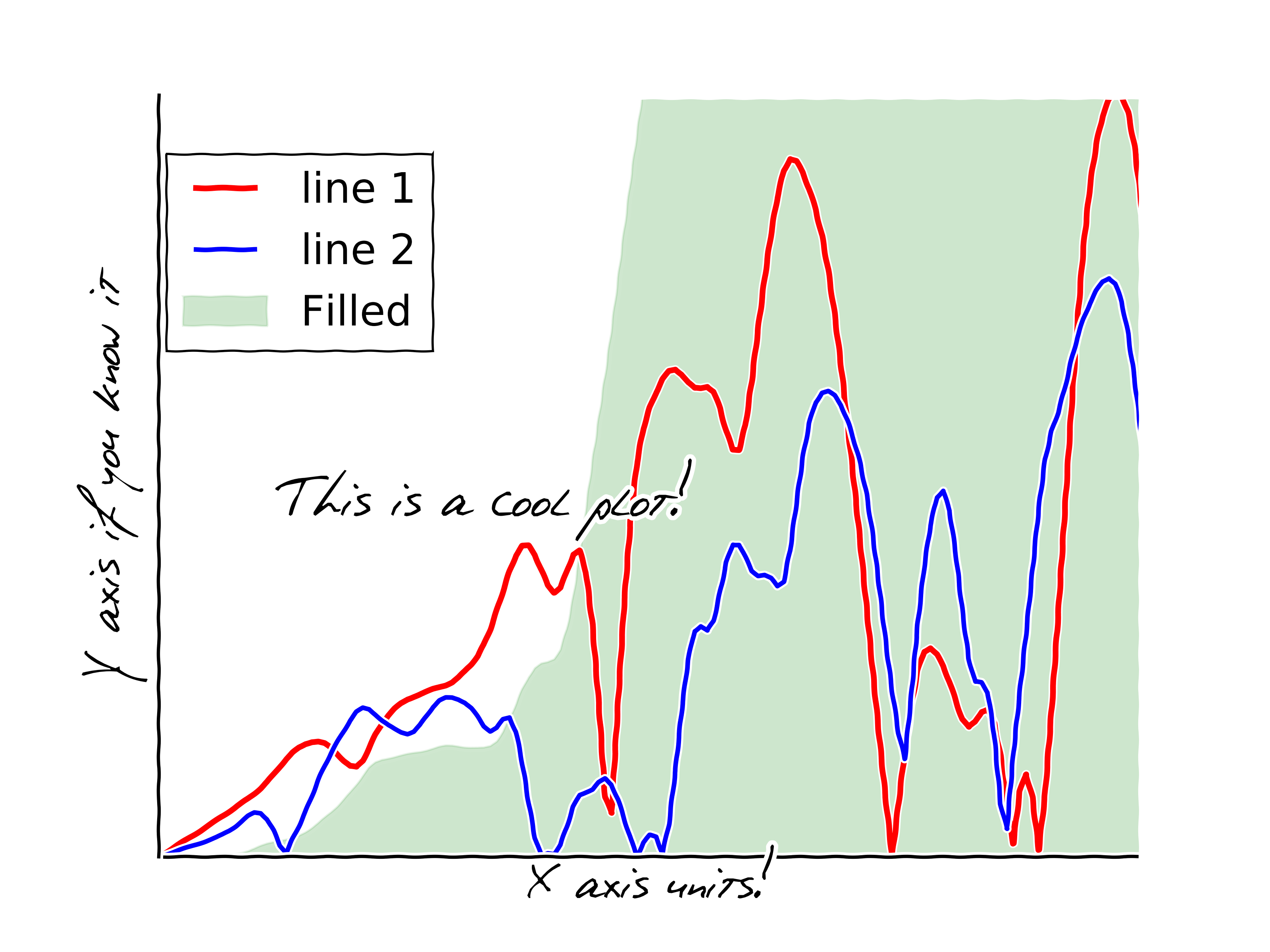
import matplotlib.pyplot as pl
import numpy as np
import matplotlib.fontmanager as fm

# Load your font file
prop = fm.FontProperties(fname='/usr/share/fonts/myfonts/phontphreaks_hand.ttf')

# Plot the axis emulating the shake of a hand
pl.xkcd()
fig = pl.figure()
ax = fig.add_subplot(1, 1, 1)
ax.spines['right'].set_color('none')
ax.spines['top'].set_color('none')
pl.xticks([])
pl.yticks([])


# Load data
l1 = np.loadtxt('data1.dat')

ax1=pl.subplot()
ax1.plot(l1[:,0], l1[:,4], label='line 1', lw=2.6, color='red')
ax1.plot(l1[:,0], l1[:,5], label='line 2', lw=2.1, color='blue')
ax1.plot(l1[:,0], l1[:,2], label='line 3', alpha=0.1, color='green')

#Add text in the plot
#-------------------------------------
ax1.text(1, 30000, 'This is a cool plot!', fontsize=30, fontproperties=prop)

#General plot elements
#-------------------------------------
pl.xlabel('X axis units!', fontproperties=prop, x=0.5, y=0, fontsize=20)
pl.ylabel('Y axis if you know it', fontproperties=prop, x=0.0, y=0.5, fontsize=20)
pl.legend(loc=1, bbox_to_anchor=(0.30, 0.95),prop={'size':19})
pl.xlim(0, 8)
pl.ylim(0, 67000)

pl.show()