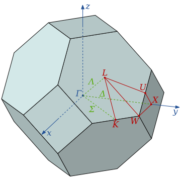
The band theory describes the electronic properties of periodic systems. It calculates the allowed energy states for the electrons within the system. There are two types of bands: the allowed energy bands (valence band & conduction band) and the forbbiden ones (gap). The distribution of this energy bands discriminates materials between, insulators, conductors or semiconductors. To make a band structure calculation, first we have to localize the high symmetry points in the Brillouin Zone of the solid, to study the behaviour of this states.
Ploting Band Structure
You can skip the previus step and download the files here: band_files.tar.gz
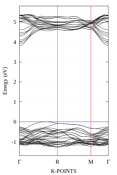
Now to plot the band structure create a new directory and copy the supercell.dat file to this directory. First column represents the path traveled by an electron in the reciprocal space, and the second is the energy of the electron in Hartree.
Use the general gnuplot template and modify the data you want to plot, in this case we are plotting the next directions of the Brillouin cell:.
G->R->M->G
In gnuplot we can to iteratively retrieve data from multiple files and plot them on the same graph. Suppose I have files like data1.dat, data2.dat ... data1000.dat; each having the same number of columns. Now we could write something like.
  plot "data1.dat" using 1:2 title "Flow 1", \
       "data2.dat" using 1:2 title "Flow 2", \
       .
       .
       .
       "data1000.dat"using 1:2 title "Flow 1000";

To write each line is really inconvenient and bored. Instead of this you can use the loop for function and summarize all in one line.
plot for [i=1:1000] 'data'.i.'.dat' using 1:2 title 'Flow '.i
The variable i can be interpreted as a variable or a string, so you could do something like.
plot for [i=1:1000] 'data'.i.'.dat' using 1:($2+i) title 'Flow '.i
Or you can use the column() function for to select an input column by label rather than by column number. Now we going to plot a band structure using the for and column() functions. You can download this gnuplot template here: band_single.p. This script will generate a png image.
#======================================================
#    Standard initialization to create the plot
#    some tags are for latin-american speakers
#======================================================
 set termopt enhanced                # Permite pone ^super/_{sub} indices
 set autoscale                       # scale axes automatically
 unset log                           # remove any log-scaling
 unset label                         #remove any previous labels
 set xtic auto                       # set xtics automatically
 set ytic auto                       # set ytics automatically
 set key top right nobox
 set palette gray
 set encoding iso_8859_1             # Para poner acentos
 set grid
#=======================================================
# title instrucctions
#=======================================================
 set title  ""
 set xlabel "K-POINTS"
 set ylabel "Energy (eV)"
#=======================================================
#          Output settings terminals
#=====================================================
#    Type of file you want to print the plot
#    eps is the most recomended
#    Default: Shows it on your screen
 set term pngcairo size 600,900 enhanced font "Times-New-Roman, 16"
 set output "band_single.png"
#=======================================================
#             Plot instructions
#=======================================================
 plot  for [i=2:60] 'supercell.dat' using 1:(((column (i) - 0.877)*27.2114)+7.674534) title   '' with  lines ls  5;
Multiplot
Our laboratory investigates the electronic properties of pure and defect materials. So making comparisons between different plots is very common.
In this section we show how to use the multiplot tool to put more than one graphic on the same canvas. For to make a multiplot is necessary create a new directory and copy all the .dat files to this directory.
Merge plots in a column
Lets merge the plots deleting the space between them. We have to unset x axis tics and x axis label of the second and third plot. As we do in merging plots in rows, we have to align them setting the y axis label but plotting the label outside canvas.
#=======================================================
# Canvas size of each plot
#=======================================================
xsize= 0.95       # Controls the image x size in the canvas
ysize= 0.265      # Controls the image y size in the canvas
yinit= 0.105      # The starting possition of the first plot
bspace= 0.012
xinit1= 0.145     # The starting possition of the first plot
col1= 0.97
xl= 0.03
yl= 0.52
#=======================================================
#          Output settings terminals
#=====================================================
#
#    Type of file you want to print the plot
#    eps is the most recomended
#    Default: Shows it on your screen
 set term pngcairo size 600,900 enhanced font "Times-New-Roman, 16"
 set output "band_multiplot.png"
#=======================================================
#  Settings of multiplot
#=======================================================
 set  multiplot layout 3 ,1  columnsfirst title "Comparison between hybrid functionals"
 set  xlabel 'Energy [eV]' #sets the x axis label
 set  ylabel "Density of states [states/eV]" offset 1,0  #sets the y axis label
 set key at  -0.5, 18 nobox # Location of the label box
 set  xr [0.0:1.185] # x ranges of plots
 set  xtics 1 #Fine control of the major (labelled) tics on the x axis
 set  yr [-4.2:3.5]      # x ranges of plots
#=======================================================
#      First plot
#=======================================================
# Reset keys
 unset bmargin
 unset tmargin  # Clears the past x possition
 unset label    # Clears the past label
 unset xtics    # Removes the x axis tics
 unset xlabel   # Removes the x axis label
#=======================================================
# Setting individual keys
#=======================================================
 set xlabel 'K-POINTS'
 set ylabel "Energy [eV]" offset 0.25,11
 set size xsize, ysize  # Plot size in relation with canvas
 set  tmargin at screen yinit+1*ysize-bspace # Controls the y final position
 set  bmargin at screen yinit+0*ysize  # Controls the y initial position
 set lmargin at screen xinit1
 set rmargin at screen col1
 set arrow nohead from 0,0.00 to 1.185,0.00 ls 10
 set label "VS_{1}" at 4,18
 set output "doss_multiplot.png"
#=======================================================
#             Plot instructions
#=======================================================
  plot for  [i=2:60] 'vacancie94.dat'  using  1:(((column (i) - 0.877)*27.2114)+7.674534)  title  '' with  lines ls 5;

#=======================================================
#      Second plot
#=======================================================
.
.
.
#=======================================================
#             Plot instructions
#=======================================================
  plot for  [i=2:60] 'vacancie96.dat'  using  1:(((column (i) - 0.877)*27.2114)+7.674534)  title  '' with  lines ls 5;

#=======================================================
#      Third plot
#=======================================================
.
.
.
#=======================================================
#             Plot instructions
#=======================================================
  plot for  [i=2:60] 'supercell.dat'  using  1:(((column (i) - 0.877)*27.2114)+7.674534)  title  '' with  lines ls 5;

pl.show()
You can download the multiplot template here: band_multiplot.p. It will generate a png image.
